Custom forms can be created by core administrators from the Administration panel to help capture information that is required to process a service or schedule a reservation. Forms are built, then linked to project templates, service templates, study projects and/or schedules. When a user requests the service or usage, they will be presented with the form to complete before submitting their request.
Managing Custom Forms
To create a new custom form, click on the Custom Forms section in the Administration tab. Then click on "Create a Custom Form". The Custom Forms panel provides a number of options to manage the custom forms of your core:
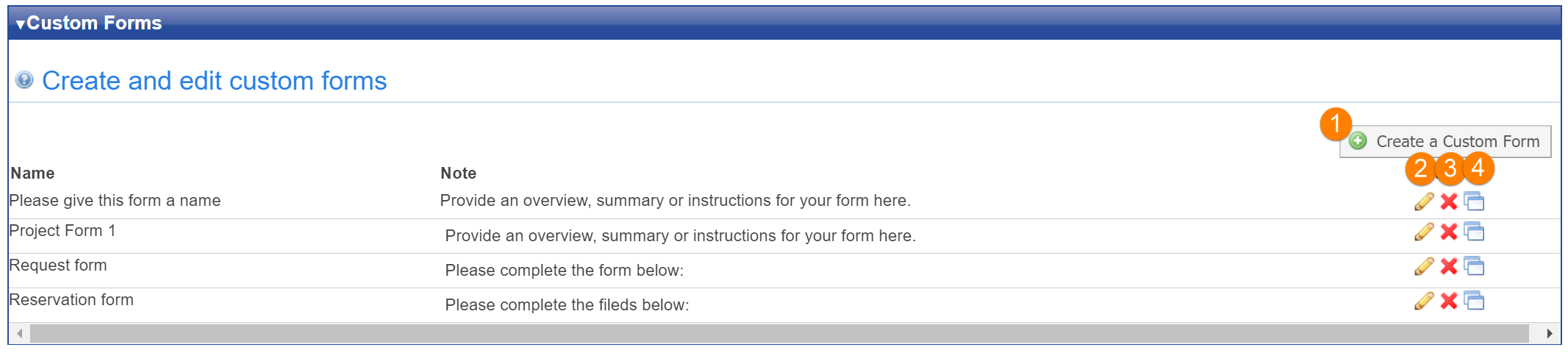
- Create: Click the "Create a Custom Form" button to add a new form.
- Edit: Click the pencil icon to edit the form
- Delete: Click the red "X" icon to remove the form
- Clone: Click the stacked windows icon to clone this form. You will be prompted to provide a name for the new form.
Edit a Custom Form
When you create a new form or edit an existing form, you be brought to the Edit Custom Form interface:
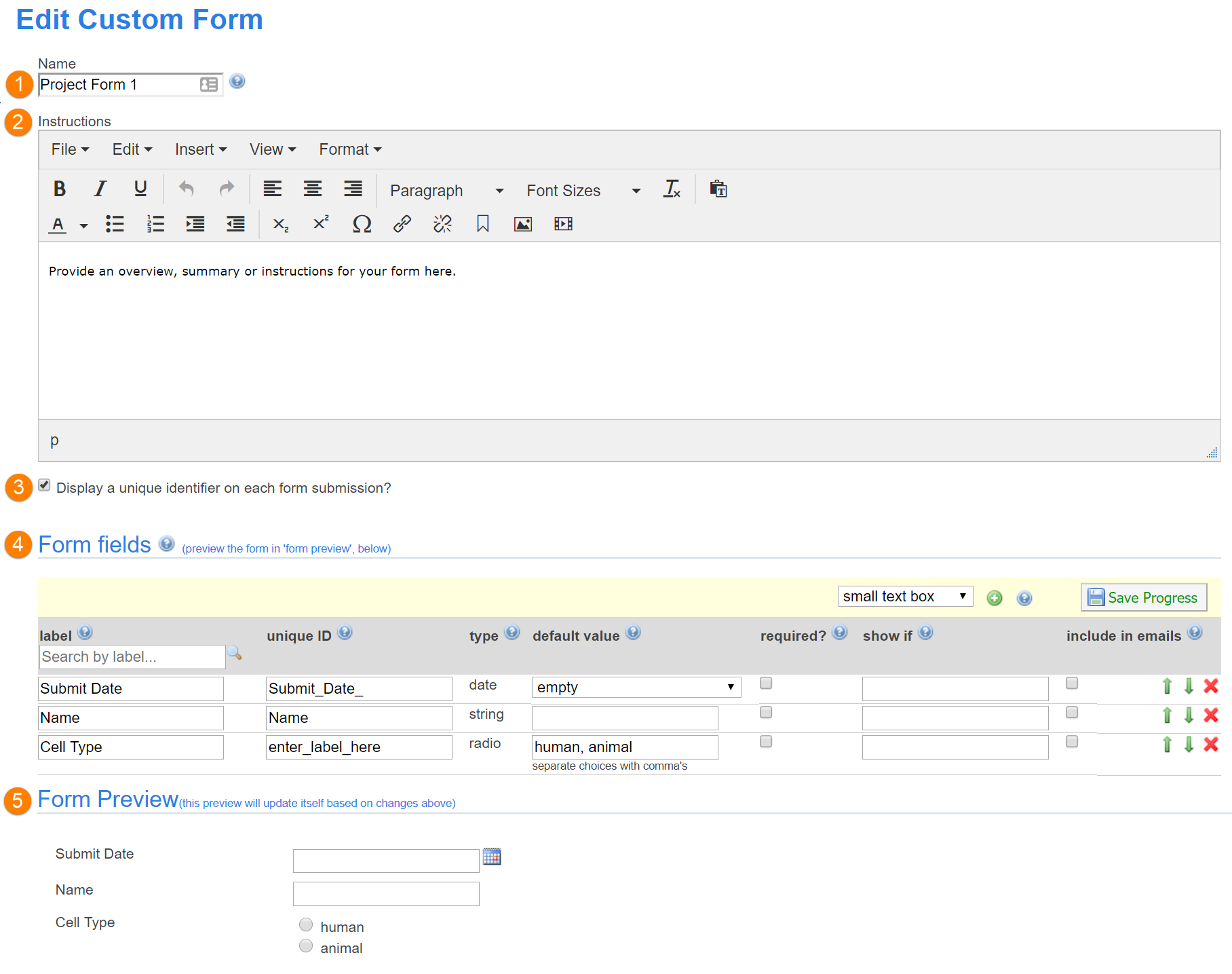
- Name: Set the name used for the form, so you can easily recognize it when associating it with a project, service, schedule, etc.
- Instructions: Include instructions to the user that will appear at at the top of the form.
-
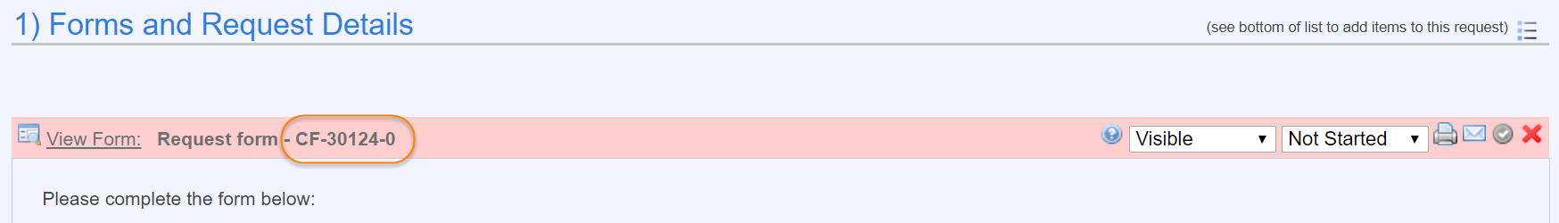
Display unique identifier on each form submission?: If this option is selected, a unique identifier is shown at the top of each form:
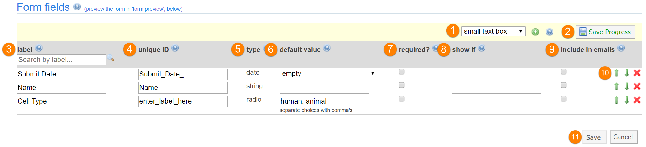
- Form fields: This area lists all the form fields that make up the form, as discussed in more detail below.
- Form Preview: Shows a preview of the form as configured by the fields above. This area is updated as you add/modify fields.
Edit Form Fields
The bulk of a form consists of the individual form fields that users need to complete. You can add and modify these fields using the Form fields interface:
-
Field type: select the field you would like to add from the drop-down, and then click the green plus sign to add the field to the bottom of the form (you can later change its position, as discussed under 10). The field types you can select include:
- 'small text box': This field allows the user to enter in a small amount of text information like a title or a quantity.
- 'medium text box': This field allows the user to enter in a medium amount of text information.
- 'large text box': This field gives a place for the user to enter in a larger amount of information like sentences or paragraphs.
- 'date': The date field gives a calendar icon for users to indicate a day and time.
- 'pull-down menu': If you want your users to choose from a list of options, but to limit them to a single selection from a predetermined list the pull-down menu is an available option.
- 'attachment': If you want to provide a place in the form for users to upload a document, you can use the attachment field option. Please instruct your users to upload a file no larger than 400MB.
- 'file template': You can provide a file for your users to download in the form. The file size limit is 400MB.
- 'radio buttons': For questions that require only one option to be chosen, for example yes/no questions.
- 'check boxes': If you want your user to be able to choose multiple options, you can use check boxes.
- 'help': The help field provides a field where you can type information in the default value column, which will show on your form preceded by a question mark icon
- 'text section': The text section is available for you to add instructions or information within the form.
- 'table': You can add a simple table to your form and designate the columns of the table for your users to fill out.
- 'grid': You can provide a dynamic table for users to fill in needed data. More information can be found below. You can add charges from grids only on service requests.
- 'charges': The charges option gives you a place for your users to enter in the quantity of units of services required for their project and then add the charges to build their own quote. This options is only available for service requests
- Save progress: Save your form, but continue editing it
-
Label: This is the name of your field. You may enter a free text label.
- HTML use on labels is not recommended but is available. Some minor validations will be applied to make sure HTML is formatted correctly. Incorrectly formatted HTML can make the form unusable so please do make sure HTML is correct.
- You can use the label search to find a field you want to view or modify within the form.
- Unique ID: You may name your unique identifier. If left blank, the system will define one for you. This field is necessary for show_if conditions within the form as described in more detail below.
- Type: This is the type of field you added (see above)
- Default value: Indicate the default options for the field. To specify predetermined options for radio buttons, pull-down menus and check-boxes, separate all of the options with a comma. Although not required, it is recommended to not put a space after each comma in the value list. For example, to show the options "yes", "no" and "maybe" in a radio button field, we recommend typing "yes,no,maybe" (without the quotation marks).
- Required?: Indicate if the field is required. If you want to highlight fields as important with the required asterisk, but not actually inhibit a user’s ability to submit a form without that information, you can mark fields as required, then in the {CUSTOM FORM SETTING} turn off 'Customer must complete all fields marked as required'.
- Show if: Indicate if you want the field to only show when specific conditions are met in other fields, as described in more detail below.
- Include in emails: Indicate whether this field should be included in service request submission emails. These fields will be displayed in a table on emails sent to core staff when a request is submitted.
- Move and delete: Use the green up and down arrows to change the position of the field on the form. Click the red "X" to delete the field from the form.
- Save and Cancel: Click "Save" to finish editing the form and go back to the Administration tab. Click cancel to close the form without keeping any of the changes you made.
Add a Grid to a Form
To capture user data in a two-dimensional table format, you can use a grid field type (as discussed above). There are a few functions that are specific to grids, as discussed below:
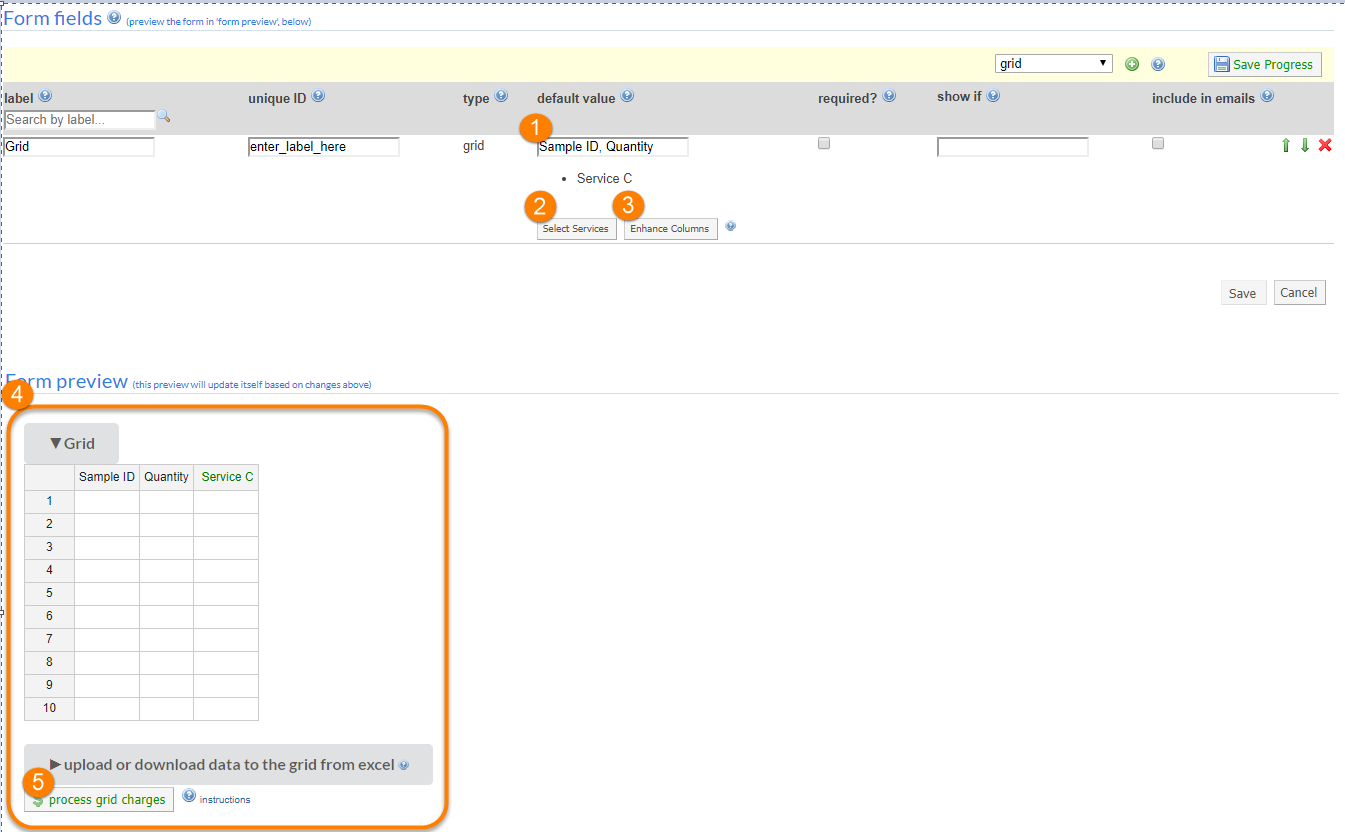
- Column names: In the "default value" field, enter the various columns you want to show on your form, separated by commas. You can further modify these columns with the Enhance Columns option discussed below.
-
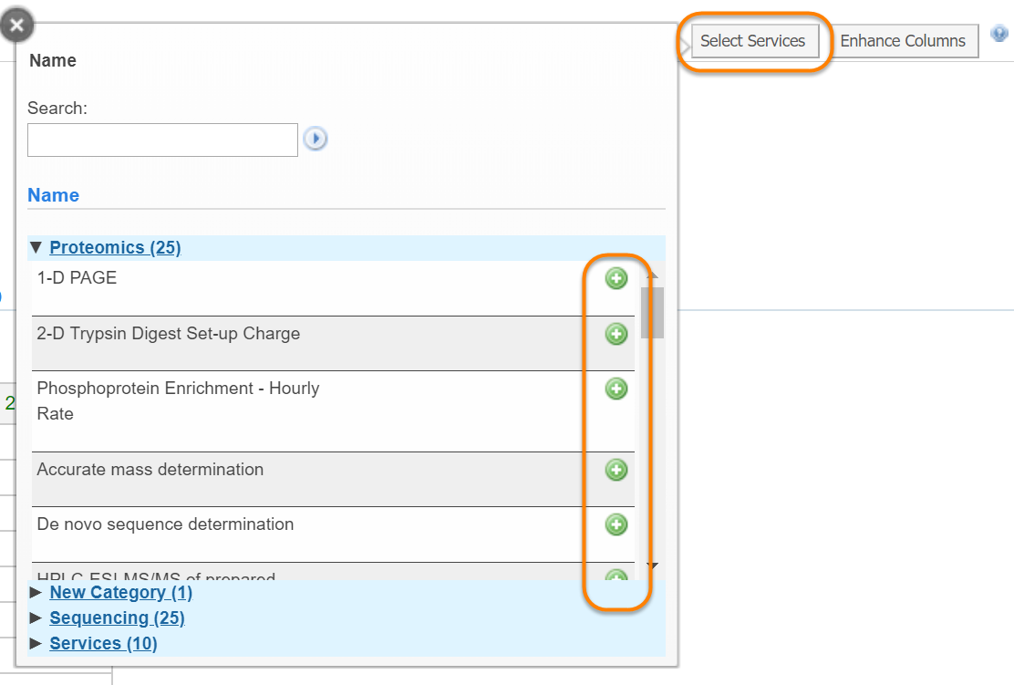
Select Services: In addition to generic columns, you can also add columns that correspond to Services defined for your core. The quantities entered into these columns can then be easily converted into charges of the service request the form is attached to, as discussed further below under process grid charges. Select the services you want to add with the green plus icons.
-
Enhance Columns: You can further define the characteristic of the generic columns you have specified on your form. By clicking on "Enhance forms", you can specific the type of column, the width, and the options (if applicable).
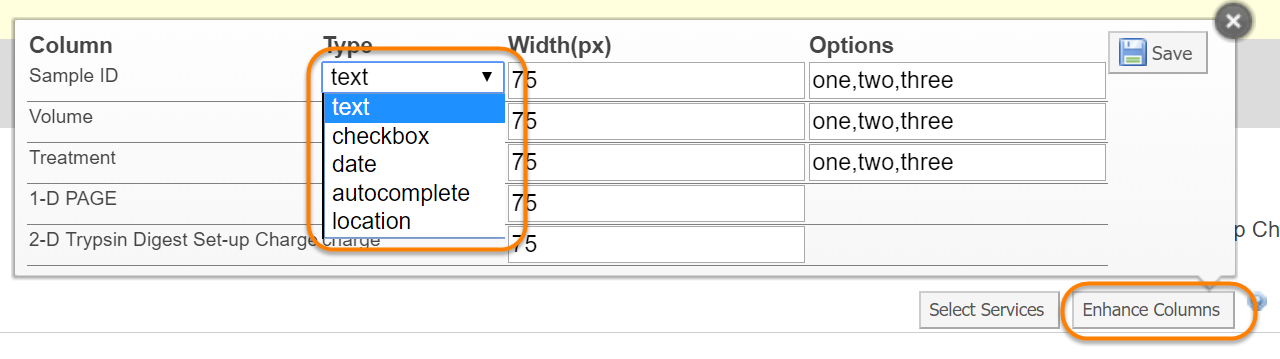
- text: free text input
- checkbox: a yes/no or true/false type input
- date: a date picker input
- autocomplete: a text field that auto-completes based on the entries in the Options column.
- location: allows selection of a location (as defined by the core)
- Grid preview: View the grid columns. Note that generic columns are show in a black font, while services have a green header.
-
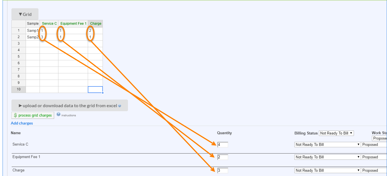
Process grid charges: When a form is attached to a service request or reservation (not in preview mode), clicking this button will turn the totals for each service column into charges for that specific service, so that they can be processed and billed (see below). For more information on managing service request, see Managing a Single Service Request.
Add a Conditional Statement to a Form
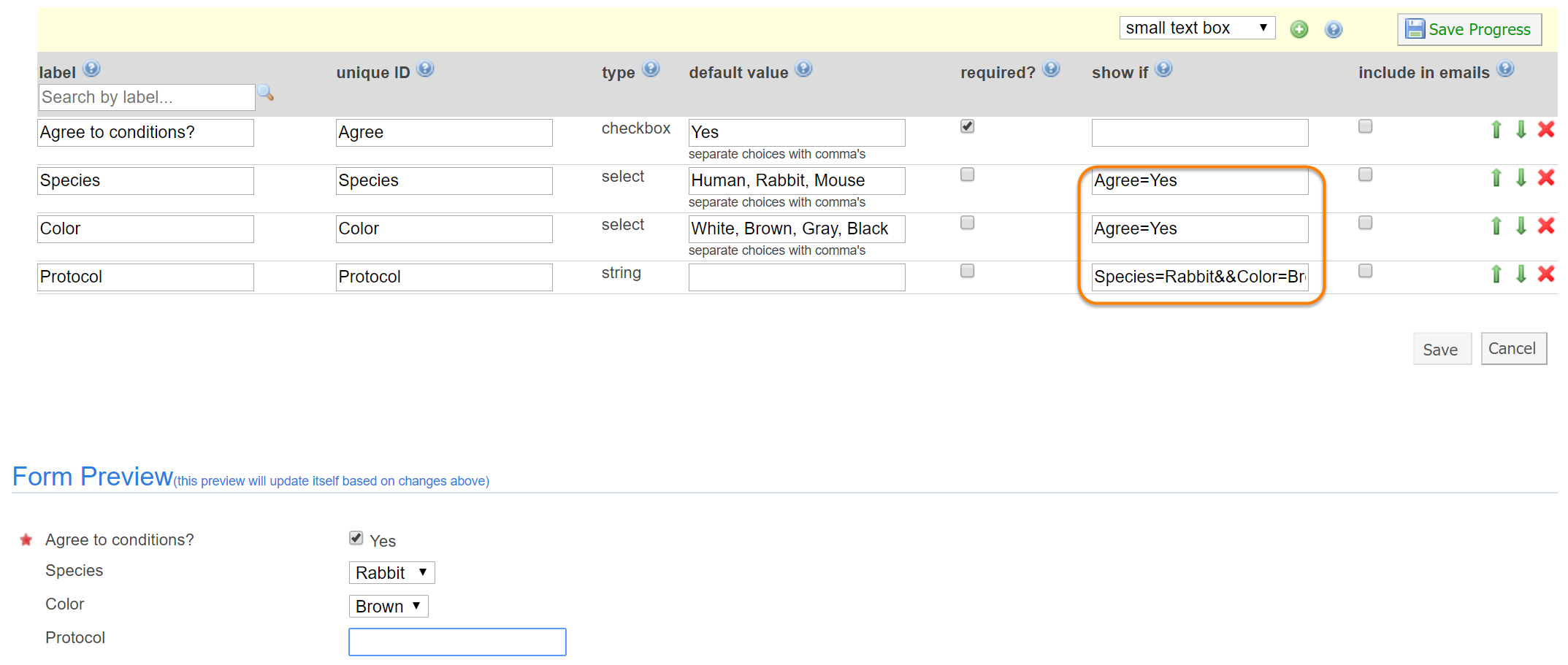
Form fields can be displayed conditionally, i.e. based on specific conditions. This is particularly helpful when using pull-down menus, check-boxes or radio buttons to conditionally display other fields. To conditionally show a field, type the exact value from the Unique ID column followed by an “=” sign and then the exact value it must equal in the show if column.
For example, if you are creating a new field that should only be shown if the user agrees to certain conditions (as captured in a checkbox field with unique ID "Agree"), you should type 'Agree=Yes' in the show if field. Note that for show if statements to work properly, each unique ID value must be different within one form and must be entered in the show if exactly as it displays in the unique ID field.
You can combine two or more conditions with logical AND and OR operators by using the && and || symbols in show if statements. Note that && has a precedence over || and will be evaluated first.
For example, if you want a new field to be shown only if species equals mouse AND color equals white, where color is another field, you should type 'species=mouse&&color=white'. If you want to expand the condition to be true for white mice OR brown rabbits, you could use 'species=rabbit&&color=brown||species=mouse&&color=white'.